Lumara Interiors: When a Website Stops Selling You Short
An interior design firm with strong creative work was being held back by a site that looked like it was built in 2005. The redesign let the work finally speak.
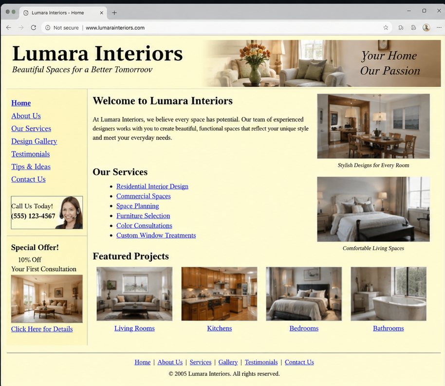
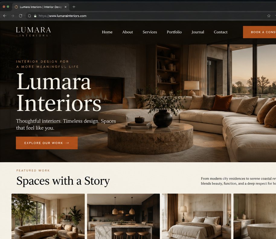
Lumara Interiors is a full-service interior design firm known for delivering high-end residential and commercial projects. When their principal designer came to us, the issue was straightforward: the firm's website looked like it was built in 2005, and it was actively misrepresenting the quality of their work.
The site had a sidebar navigation, Times New Roman headlines, a slideshow from an abandoned plugin, and project images sized at 640×480 pixels. The portfolio the heart of any interior design firm's website was buried under three clicks and displayed in a cramped grid with no room to breathe.
The Problem With Dated Design In A Visual Industry
Interior design is a trust business. Prospective clients are making significant financial and personal commitments. Before they contact a firm, they are looking for evidence that the firm understands beauty, proportion, and detail at the same level they do.
A website that looks dated communicates the opposite. It signals that the firm does not pay attention to its own presentation which raises questions about whether it pays attention to the client's.
The Redesign
We built the new Lumara Interiors site around a single principle: the work should be the page. Every layout decision was made to surface the photography as large and as early as possible.
The homepage opens with a full-bleed editorial hero a single project image at 100% viewport width, with a minimal text overlay in a refined serif typeface. The headline and CTA sit in the lower third, never competing with the image.
Navigation moved to a minimal top bar: Logo, Portfolio, Services, Contact. Nothing else. The sidebar was eliminated.
The portfolio grid was rebuilt with variable-height cards a masonry layout that handles landscape, portrait, and panoramic project images without cropping them into identical boxes. Each project opens to a full-screen slideshow with keyboard navigation.
Typography shifted to a pairing of a refined display serif for headings and a clean geometric sans-serif for body text a combination that reads as contemporary luxury without effort.
The CTA colour a burnt-orange drawn from one of the firm's recurring material choices gave the site a warm, intentional accent that connected the design system to the firm's aesthetic sensibility.
The Outcome
The new site opened with the work in its best light. Enquiry quality improved immediately prospects who contacted the firm after visiting the new site arrived with a clearer sense of what Lumara does and a higher confidence in the investment. The site finally matched the quality of the firm it represented.