Noor Collective: Growing Up a Brand Without Losing Its Soul
A Riyadh fashion brand had a logo that read as a children's brand. We rebuilt the identity around the Arabic meaning of the name and the result speaks for itself.
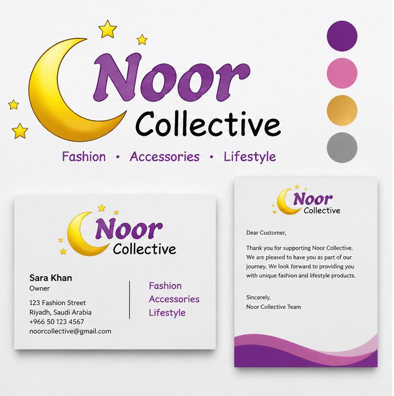
Noor Collective is a Riyadh-based fashion and lifestyle brand founded by Sara Khan. When she came to us, she had a logo a yellow crescent moon with colourful stars and a playful wordmark. It was the logo her first designer had made, and it had served its purpose in the very early days. But as Noor Collective grew, the brand was getting in the way.
The logo read as a children's brand. It communicated "affordable and fun" when the actual product offering curated modest fashion, accessories, and lifestyle pieces warranted "sophisticated and intentional." Customers who encountered the brand for the first time were not receiving the right signal.
The Brief
Sara was direct: the brand needed to grow up without losing its soul. Noor means light in Arabic. The crescent moon was meaningful and worth keeping. What needed to change was the execution the colour palette, the typeface, the level of craft in the mark itself.
The Identity We Built
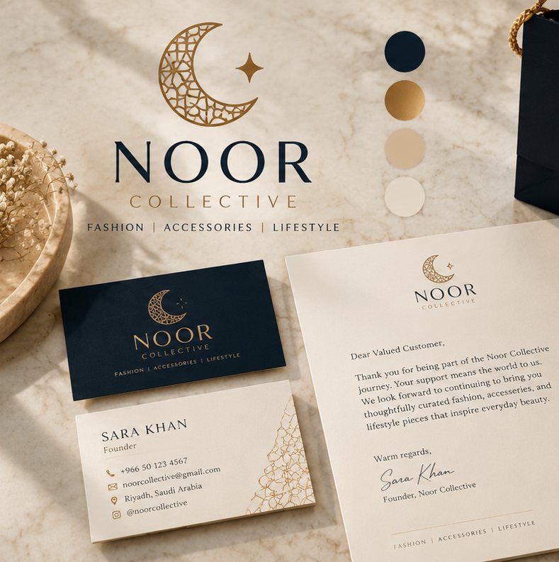
The new logo retains the crescent motif, now rendered in fine gold linework with an arabesque fill pattern a subtle reference to Islamic geometric art that resonates with the Saudi market without being literal or stereotyped.
The wordmark moved from the playful mixed-weight script to a clean, spaced serif: NOOR in capitals, COLLECTIVE below in a lighter weight. The lockup is elegant, confident, and legible at any size.
The colour palette shifted entirely. We replaced the purple, pink, gold, and grey combination with a focused system: deep navy, warm gold, and cream. Three colours. Complete visual consistency across every touchpoint.
The Stationery System
The brand's new stationery business cards, letterhead, and packaging was designed as an experience, not a formality. The business card uses deep navy stock with gold foil for the logo. The letterhead uses the arabesque pattern as a watermark element. Packaging was designed with the same editorial restraint cream bags with gold rope handles and a foil logo stamp.
What Changed For The Business
The rebrand coincided with Noor Collective's expansion into a second product category. The new identity gave that expansion visual credibility the brand looked like it belonged in the market it was entering, which is the most important thing a brand identity can do.