Qurta Fashion: Building an E-Commerce Experience the Market Expects
The modest fashion market has matured. A 2008-era WordPress template was costing this brand customers who expected editorial-quality design. Here is what we rebuilt and why.
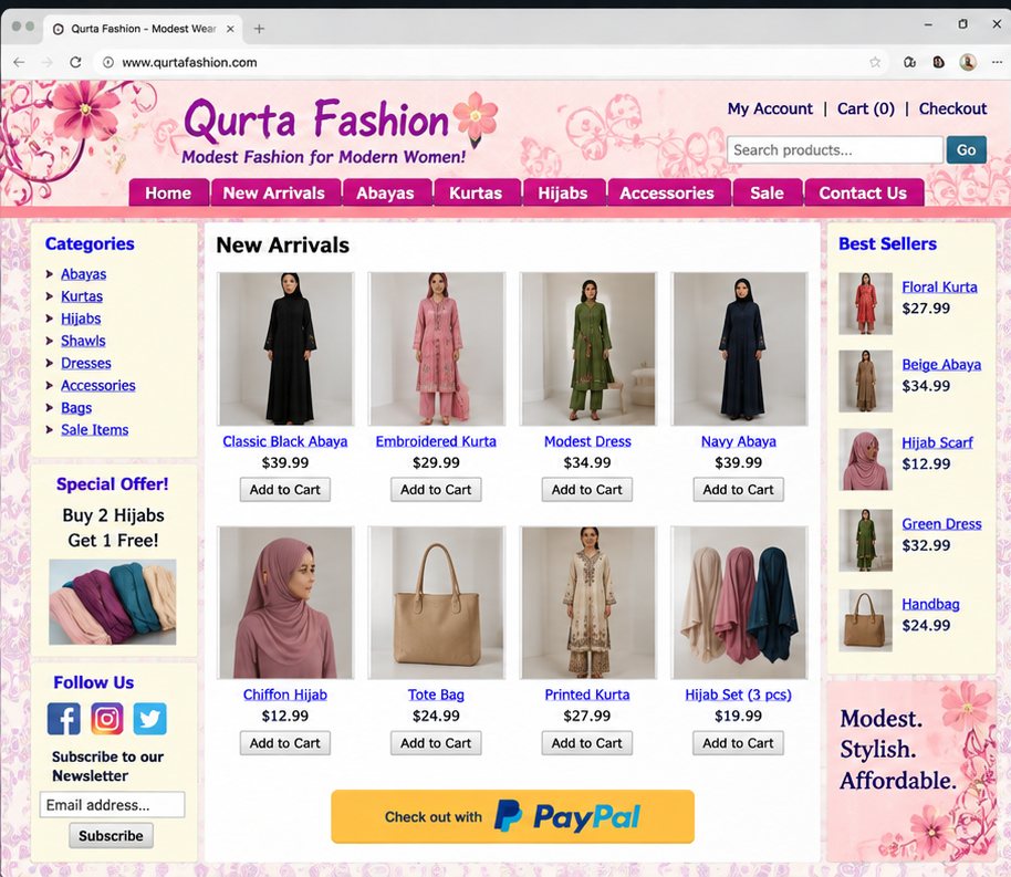
Qurta Fashion had an e-commerce site that was actively hurting sales. Not because it was broken orders processed, products displayed, payments went through. It was hurting sales because the design communicated the wrong things: that the business was small, dated, and not worth trusting with a purchase.
The original site used a WordPress template from roughly 2008. Pink floral gradients, an overcrowded sidebar, a PayPal button in the middle of the homepage, and product photography that varied wildly in quality and background. The brand tagline "Modest Fashion for Modern Women" was promising. The execution was not.
What Modest Fashion Customers Actually Expect
The modest fashion market has matured enormously in the last decade. Brands like Reformation, & Other Stories, and Net-a-Porter have shaped the visual language that premium fashion customers now expect even when shopping modest-specific brands. Clean white space. Editorial photography. Confident, restrained typography. Minimal navigation.
The original Qurta Fashion site was calibrated to a market expectation that no longer exists. It was competing against a standard it had not noticed was set.
The Redesign
We started with the product photography brief. Every garment was re-shot on a single consistent background warm cream tones to complement the modest aesthetic with consistent lighting, model posing, and crop ratios. This alone transformed the catalogue.
The navigation was stripped to five categories. The sidebar was removed entirely. The homepage became a full-width editorial experience: a single hero product, a featured collection, and a curated "New Arrivals" grid.
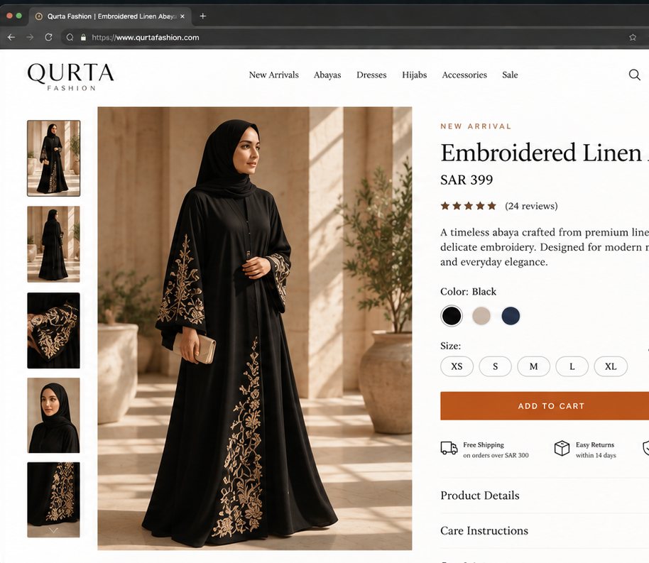
The product page was the most important transformation. The original had an "Add to Cart" button below a dense block of text, pricing in small type, and no size guide. The redesign led with the product name, price, and size selector above the fold with the burnt-orange CTA button impossible to miss.
The Outcome
Conversion rate on the redesigned site was significantly higher than the original in its first quarter a result of reducing friction in the purchase journey and building the visual trust that leads a first-time visitor to become a first-time buyer.